Project Overview
I led the end-to-end UX redesign of a web platform for a healthcare company, built to monitor and manage medical assets across multiple hospitals in real time. The existing system was functional but outdated, difficult to use, and not scalable across departments.
My mission: simplify a complex legacy system into an intuitive, efficient tool tailored for real clinical environments — particularly nurses and technicians — while aligning with strict business and technical constraints.
Understanding the Users
The process began with in-depth interviews with nurses, technicians, and customer support specialists. I wanted to understand the real-world pain points they faced daily. From these conversations, two key personas emerged:
- Nurses, who needed quick, no-hassle access to asset information under time pressure.
- Technicians, who required a more advanced overview for tracking, maintenance, and system checks.
These insights helped us move beyond assumptions and prioritize actual user needs.
Aligning with the Business & Tech Side
Next, I collaborated with stakeholders and developers to define:
- Business goals, like reducing training time and improving task completion speed.
- Technical limitations and infrastructure capabilities, ensuring we weren't designing in a vacuum.
This alignment helped prevent feature creep and ensured feasibility from the start.
Mapping & Simplifying the Existing System
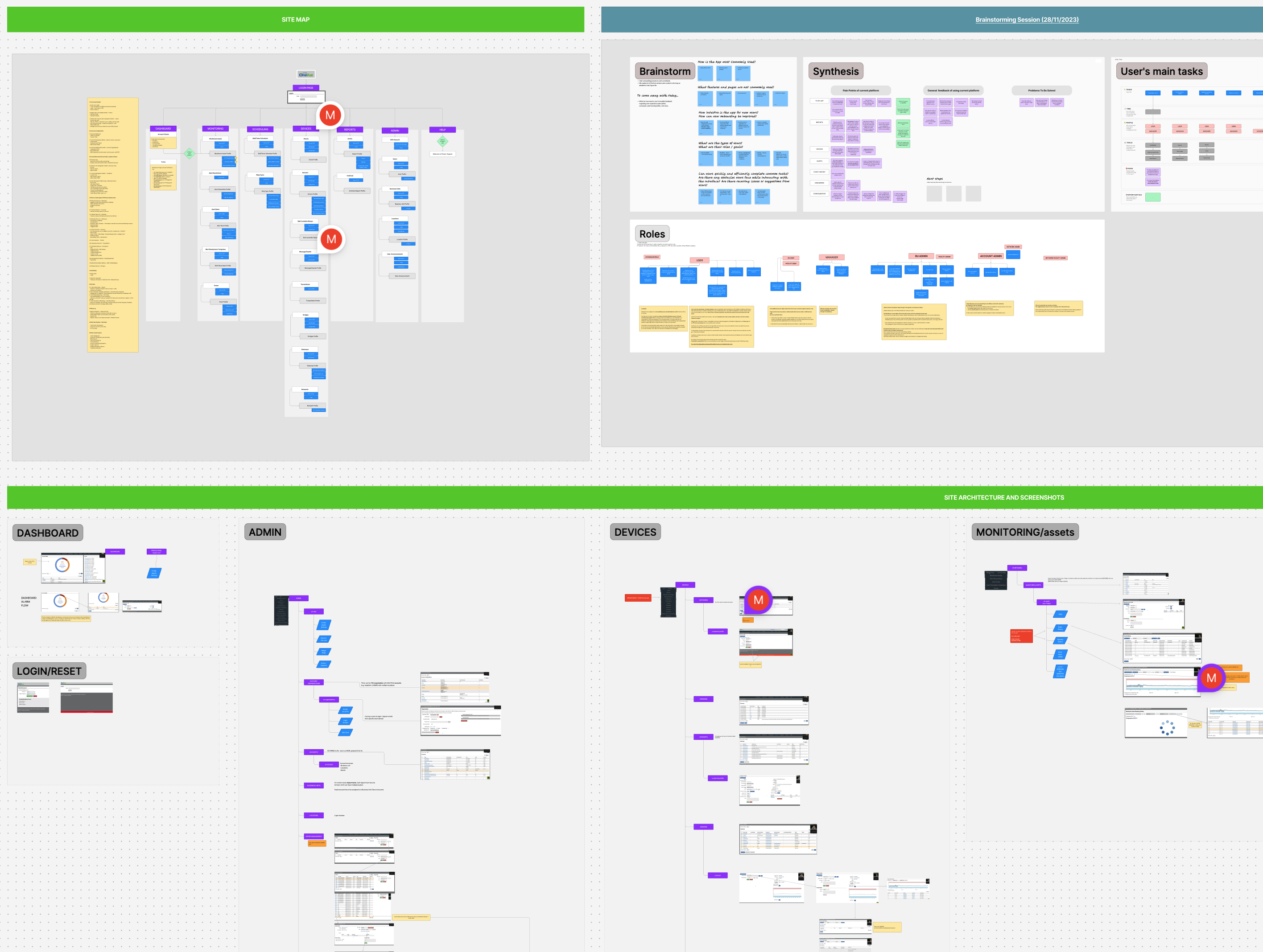
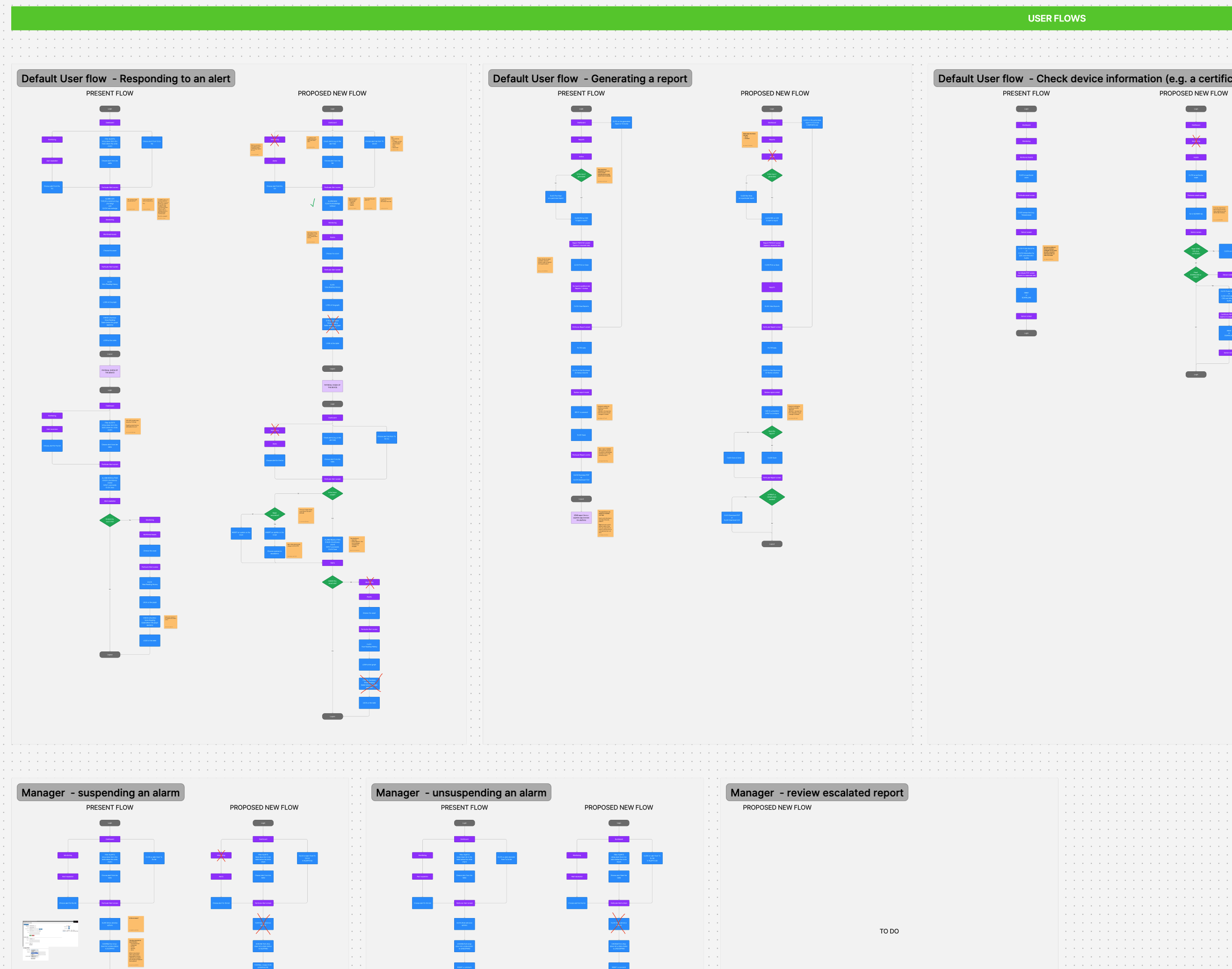
I mapped out the current system architecture and user flows to pinpoint usability bottlenecks. It was clear the platform had been built around internal logic, not user behavior.
I restructured the flows to align with how nurses actually think and work — prioritizing speed, clarity, and fewer steps.
For technicians, I retained the depth of data, but reorganized it for better discoverability.
Designing Wireframes
With new flows defined, I created a fresh set of wireframes focused on:
- Task-based interactions
- Clear visual hierarchy
- Reduced cognitive load for common workflows
Each screen was designed to feel familiar but significantly more efficient — no more hunting through multiple tabs or guesswork.
.png)
Testing with Real Users
The wireframes and user flows were reviewed with:
- Nurses (for usability and speed)
- Technicians and developers (for functionality and feasibility)
Their feedback helped me fine-tune components, simplify interactions even further, and identify edge cases that weren't initially obvious.
Building Out the UI & Iterating
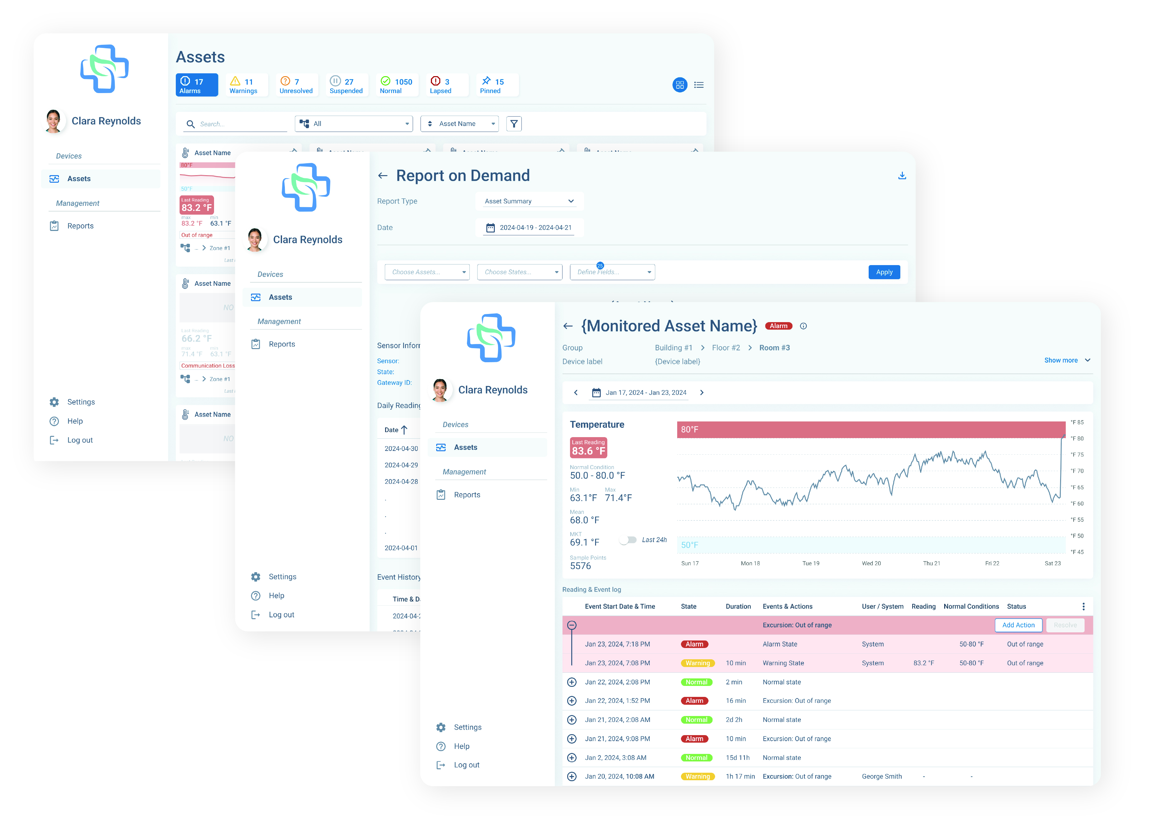
I crafted a clean, intuitive UI tailored for clinical environments, with a strong focus on clarity, accessibility, and ease of use under real-world conditions. Every detail — from spacing to iconography — was designed to reduce friction for users under pressure.
I organized twice a week meetings with the development team to demo progress, align on details, and ensure the design was implemented accurately and efficiently. These regular syncs helped us catch edge cases early and keep momentum throughout the build phase.